Sunday, May 8, 2016

I'll Code Up Your Life

     Websites are a crucial entity of completing a comprehensive portfolio in the world of graphics, art and promotion. Learning how to build a website is important if you wish to move on in the world of any type of marketing, public relations or advertising. My website will be used to promote myself by showing examples of my work over my time here at school. Furthermore, it gives insight into my talents and a small background into my life as an individual. Using this website to promote myself will give employers something else to look at besides résumé. This website allows someone wishing to hire me to put a face to a name which is very important in the process of looking for a job. Once more, it allows employers to access any professional social media sites that give more insight into the qualities you can provide.
      Designing this website was interesting. Knowing how design a website has always been a passion. For myself it is possible to figure out what toe do when it concerns the other aspects of the creative suite. However, when it came to designing websites I was falling show. Of course we did not build the website from the ground up. We merely made a few clicks, something that would take you all of five minutes. For us, changing a few characters and connecting a few folders is not what it takes to build a website. However, it began to show the amount of work and time that has to go into building any website. Writing ‘code’ is completely out of my realm and even beginning to learn how to write code takes years and years of experience.
         The moral of the story is that building this website without the help or foundation of the website or code. Without a step-by-step guide to inputting all of the information it would have been almost impossible. When we began to put words into place and pictures where they belong it began to come along. It was fun watching all of the work come together with a couple little clicks and switches. There were a few challenges. If you remove one piece of coding it can ruin the entire thing and if you are not that experienced in working with Dream Weaver it makes it more complicated than it would be for someone that may be very skilled in the program.
     Nevertheless, it was a great opportunity working with Dream Weaver. Even learning the littlest amount of working with a website programs helps with future sites. It was difficult in wrapping your head around the fact that one step could break the entire site. But it shows how important it is organizing files in the right spot. Working with websites is probably the most difficult program to use and entire classes are dedicated to learning how to work them. But in all creating a small but useful website will stay with us.

Sunday, May 1, 2016

Dope Logos


FedEx has done an excellent job in expressing the company’s duties within their logo. The design element used inside the word “Ex” creates an arrow to exemplify speed and efficiency. Also, they make a play on the word “Fed”. They have incorporated a spoon in the letter “E”. The colors purple and orange are complimentary therefore, work well as highly recognizable logo.


 Pinterest has also made a play on what their company does. They took the letter “P” and redesigned it to look like a pin used on a pinning board. Also, the color red is a very strong color and is thought of something important. Pinterest is used for saving your favorite ideas and important tips and recipes. 


The iconic Morton Salt logo is a staple in every kitchen in America. The logo is effective because if you were just shown the girl carrying the umbrella and container and salt it is entirely recognizable as the logo of Morton Salt. The tag line “when it rains it pours” is brilliant in regards to when you pout the salt out of the container. 


The World Wildlife foundation is yet another iconic logo. The logo is understood across all languages. So it is effective in expressing the meaning of its purpose, for animals. Simple and elegant in black and white it is easily transferable to any platform and medium. 


Rolex is known for its high quality products and exquisite designs in watches. Therefore, they needed a logo that represented something prestigious. What is color is as prestigious as gold. A gold crown to represent Rolex is a simple and effective message. Their products are fit for a king. On the other hand Rolex is typed in a green font. Green corresponds with the idea of energy and more in relation to this product, money and ambition.
 

            When you see the name Barbie everyone knows exactly what to picture in his or her mind, blonde, pretty, skinny and a California girl. Although recently that image has changed to market to a wider variety of young girls in all shapes, races and styles. However, the logo and title Barbie has not changed. Although the use of script text is presented it resembles the image of a Barbie and the attitude of the company. The name can also be easily recognizable in black and white.

Wednesday, April 27, 2016

Lemme Take a Selfie

            When I began learning the creative suit programs back in high school I never thought that you could incorporate all of the programs into one project. However, since learning, and refreshing my knowledge its becoming clear that I do not know as much as I though I did. We have incorporated each program into projects over the semester, but not until the post card project did it all make sense. I wish I had known how to create a clipping path back in high school, because it would have helped me up till now.
            This design is essential exercise in design communication because it is a great stepping-stone in learning how you personally view your individual self. It is hard to design for other people and companies. You have to first learn how the company works and how the company wants to be viewed. Their image says a lot about their company. This post card project gave us the opportunity to create an image for ourselves using our own personal picture. People are very particular about how they take photos and selecting a photo you like of yourself is even more particular. This project was essential because it helped us identify ourselves as graphic designers. From here we can learn to immerse ourselves in identifying with other projects. By giving us the tools to create a design for another company that may or may not have our own little touch to it.
            The use of color in my design was very important. I selected the color of my shirt and accented it to the rose flowers to the left. This helped create balance on my post card. I also changed the color and texture to my photo. Even though the photo was a high resolution I thought it could create a visually appealing type of watercolor painting. The background color is a neutral with a canvas texture on it that also coincides with the watercolor theme. Watercolor is typically a very soft and delicate much like the flowers to the left. My hair is very calm and straight. This goes along nicely with the idea of the post card being soothing. I did not want to use the typical black font coloring so I went with a dark blue color. I wanted the coloring to look soft to match the shape of the font and the general flow of the post card, but more on that later. Blue is softer than grey and black, but it is still legible. Although there is no blue in the photo or graphic I believed it to accent the dark maroon red of the roses and my blouse.
            The fonts that I chose to use were a font called Noteworthy, which I received from Dafont. My name font I am not sure of, I have it downloaded to the computer in class, as well as the Illustrator file that contains the name of the image. Nevertheless, both fonts are slightly loopy. Loopy I mean cursive, or gently gliding from one letter to the next. Noteworthy has the look of a font you would see in a elementary school class room. Even though I do not plan on becoming a teacher, my photo has this type of innocence to it, which if you catch me on a no makeup or hair not done day, is quite the opposite of innocent.

            The use of design hierarchy in my post card is solid. My post card is equally balanced on both sides and my text wrap appears on both sides of my photo and graphic. This creates a nice flow from the graphic to the text and over to my photo. Using Illustrator, InDesign and Photoshop for the post card project was not difficult. Rather it made completing the project must faster. I feel more confident about placing documents into different programs now. Furthermore, taking advantage of the strengths that each program has to offer. I would not have been able to accomplish the project without the strengths that the programs have to offer, for example, editing my photo and applying a filter as I did in Photoshop. In closing this project was a crucial element in the learning the design process. We had used all of the programs individually but now after completing the project it helped create cohesion across the board with the use of the programs. Furthermore, I think it has helped each of us realize what program to use when we need to accomplish a specific task.

Wednesday, March 9, 2016

Soup, Animals & Wind

Creating awareness for any societal issue is a challenge in and of itself. However, it is important to bring the attention of these issues to people because we are the root at which the issues have stemmed. To begin shark fin soup, a delicacy in Asia, started with humans and the only way to prevent the further finning of sharks is to prevent the consumption of one type of soup. Another issue to raise awareness to is pitbulls. Pitbulls have a reputation of being scary animals and being involved with dogfights. Unfortunately, the only reason they are stereotyped as being that kind of dog is due to humans. So you are left with shelters filled with pitbulls that most people fear. Finally, the awareness and understanding of how much energy humans consume is important. Understanding renewable energy like wind turbines is also important to reduce the consumption of fossil fuels. Therefore, creating awareness for all kind of societal issues whether it's animals or energy is important in protecting the world we live in.
            Shark finning recently has become a topic of conversation in the environmental world. Finning sharks has been popular in the Asian communities. Corresponding most directly with the culture aspect of consuming shark fin soup. The soup is look upon as a delicacy and as a socially superior status. Those families that can afford to serve or eat shark fin soup are considered wealthy in the Asian communities. Unfortunately, finning sharks is very frowned upon according to many environmentalists. Sharks are caught by long line fishing techniques. The sharks are brought aboard, taken and their fins are cut off and preserved on ice. The most destructive and inhumane part of it all is what occurs to the remains of the shark. Once finned the sharks are returned to the ocean where they come to a suffocating death. Sharks must swim in order to provide oxygen to their gills and with no fins cannot swim and instead sink to the ocean floor. There have been many conservation attempts in efforts to protect sharks from the Asian community. However, sharks are still-hunted today. For these reason, and many others, including the impact their loss would have on the ecosystem, shark finning is a very concerning issue.
            Pitbulls have a terrible reputation. They have been classified as attack dogs, dangerous and outcasts in the world of dogs. Pitbulls are typically sent to shelters where they live out their lives until they are put down. Their bloodline traces them down to a combination of bulldogs and terriers originally bred in the United Kingdom. Used in blood sports they are the leading breed used in illegal dog fighting, considered a blood sport. From there stemmed their reputation as dangerous dogs. Unfortunately, humans guided them into this role. Pitbulls, as I can speak from experience, are truly loving animals. Pitbulls have been police animals, service dogs and therapy dogs. They protect their owners, and are one of the most affectionate dogs out there.  Pitbulls need a voice. The reputation has been destroyed and they deserve love and affection as much as and pure breed dog. For those reasons, Pitbulls deserve to be protected and taken care of.
            Searching for an alternative energy is a never-ending quest. Environmentalist and politicians are constantly looking for a new way to create energy. Human’s high consumption of fossil fuels raises the issue of needing to find another source. One source that we have come to use is wind energy. Wind turbines have been in use for at least a hundred years. But not until recently did we begin to store and preserve the energy and put it on the grid. Wind turbines span across the United States and even still across the world. It is a clean renewable resource. Even still having wind turbines create incentives for landowners, therefore, even though they take up space they benefit the landowner. Not to mention, how interesting they are. If there is ever an opportunity to see a wind farms it is truly astounding. They are absolutely massive machines and offer such an amazing benefit to society.
            Understanding different aspects of the world gives a better understanding and perception of the world. Shark finning is an ecological disaster and creating awareness is one of the only ways we can stop it completely. If people do not eat shark fin soup then the demand for shark fins will become extinct. Another animal that is also hurt by humans is Pitbulls. Pitbulls need a new image and with a little awareness you can protect them. Furthermore raise awareness for the adoption of not only pitbulls but to save all shelter dogs that need adoption. Finally, we covered a renewable energy. Wind energy could offer society a pathway into the clean consumption of energy, of which we use at an exponential rate. Therefore, it is important to bring awareness to different types of clean energy, including wind turbines.


Wednesday, January 27, 2016

Tiffany Mickey Ray


Communication is expressed in various mediums. How an individual responds to that medium is in the eyes of the beholder whether it’s based on religion, emotion, knowledge or connection. The medium of communication that I respond to most directly is visual. Visual communication is powerful. Visual communication can persuade, inspire or disgust all at once with a single image. For that reason, I believe that any type of visual communication could be interpreted in a variety of different ways which influences viewers to think harder about what has been presented to them. I also have a strong response to written communication. Words arranged powerfully sit on a pedestal; words have the power to persuade the nonbelievers. As a result, written communication is just as powerful and moving as visual communication.


Visual communication is a compilation of many elements in order to produce a visually appealing product. Necessary tools for creating visual communications include images that provide any type of emotion, for example, sadness, happiness, aggressive, assertive, willingness, empathy or sincerity. Color is also a very important tool in visual communication. Drawing-in viewers by catching their eye with popping color, or different fonts makes people stop and look. Color can create a overall theme of what is being communicated. Another tool for visual communication is the choice of medium. How visual communication is broadcasted, printed or streamed will influence how the audience responds to it.


Disney is a great example of a company with strong positive visual communication. As a conglomerate, Disney, is recognized as a company with its roots set deep within you since childhood. When you see a Disney introduction for a movie with their distinguished font you can trust that it won’t steer you wrong. They have created images that directly tie their company to their brand, for example when someone says Mickey Mouse your internal response is Disney, or if you say ESPN for those in the know will recognize the connection to Disney. Furthermore when relating an emotion to Disney you think ‘happiness’ and their use of bright color to attract children and the kid in all of us today.


Another example with strong visual communication is Ray Ban. Ray Ban product is so unique and identifiable that picking out authentic product is too easy. Their classic red, white and black logo written in that California cool font makes you believe you are living a California life. Also when you see Aviators or Wayfarers in movies you can immediately understand that they are probably Ray-Ban.

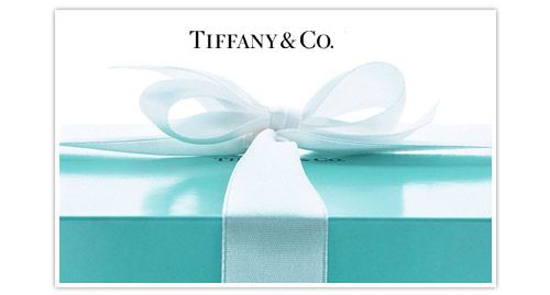
         Tiffany’s has managed to create this elegant visual communication. Their consistent use of the classic Tiffany Blue and striking font gives the appeal to a sophisticated company. Tiffany & Co. wants you to believe that if you wear what they have you will feel beautiful and apart of a group. The movie Breakfast at Tiffany’s also ties to their name as beautiful and elegant, especially for the younger generation of women who think of Audrey Hepburn and relate her to Tiffany’s.