Communication is expressed in various mediums. How an individual responds to that medium is in the eyes of the beholder whether it’s based on religion, emotion, knowledge or connection. The medium of communication that I respond to most directly is visual. Visual communication is powerful. Visual communication can persuade, inspire or disgust all at once with a single image. For that reason, I believe that any type of visual communication could be interpreted in a variety of different ways which influences viewers to think harder about what has been presented to them. I also have a strong response to written communication. Words arranged powerfully sit on a pedestal; words have the power to persuade the nonbelievers. As a result, written communication is just as powerful and moving as visual communication.
Visual communication is a compilation of many elements in order to produce a visually appealing product. Necessary tools for creating visual communications include images that provide any type of emotion, for example, sadness, happiness, aggressive, assertive, willingness, empathy or sincerity. Color is also a very important tool in visual communication. Drawing-in viewers by catching their eye with popping color, or different fonts makes people stop and look. Color can create a overall theme of what is being communicated. Another tool for visual communication is the choice of medium. How visual communication is broadcasted, printed or streamed will influence how the audience responds to it.

Disney is a great example of a company with strong positive visual communication. As a conglomerate, Disney, is recognized as a company with its roots set deep within you since childhood. When you see a Disney introduction for a movie with their distinguished font you can trust that it won’t steer you wrong. They have created images that directly tie their company to their brand, for example when someone says Mickey Mouse your internal response is Disney, or if you say ESPN for those in the know will recognize the connection to Disney. Furthermore when relating an emotion to Disney you think ‘happiness’ and their use of bright color to attract children and the kid in all of us today.
Another example with strong visual communication is Ray Ban. Ray Ban product is so unique and identifiable that picking out authentic product is too easy. Their classic red, white and black logo written in that California cool font makes you believe you are living a California life. Also when you see Aviators or Wayfarers in movies you can immediately understand that they are probably Ray-Ban.
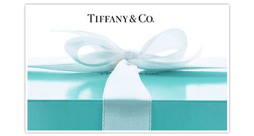
Tiffany’s has
managed to create this elegant visual communication. Their consistent use of
the classic Tiffany Blue and striking font gives the appeal to a sophisticated
company. Tiffany & Co. wants you to believe that if you wear what they have
you will feel beautiful and apart of a group. The movie Breakfast
at Tiffany’s also ties to their name as beautiful and elegant, especially for
the younger generation of women who think of Audrey Hepburn and relate her to
Tiffany’s.
The BEST! Well centered, strong, well grounded, loyal ... and tenacious... Olivia Quinn does not quit. A precious and inspiring individual who is... Honestly Lovely!!
ReplyDelete